Sunday, November 4, 2012

Monday, October 22, 2012
Character Creation

Name : Santa Teresa
Hobbies : Kill, drink blood, spread aging, decay
Relationship status : Single
Favorite color: Darkness has a color?
Favorite food : Epidermis and dermis
Wednesday, October 17, 2012
CAGSY Packaging of Product
Research & Brainstorming
 Tutti Frutti has their own size of cup to fill the yogurt in. For large, medium and small.
The concept is nice, as I'm going to use the same concept to differentiate the cup size.
Planning to design fruits to differentiate the cup size. Example would be either strawberry or grapes for small cup size, for medium size either apple or orange and Watermelon as the large cup size.
The background color of CAGSY's cup would come in various color according to the fruit. The brand should also be included on the cup to avoid copyright, as it is originated from the brand itself, CAGSY. The tagline to explain CAGSY would also be included inside.
The packaging should not be as sophisticated as it is. It shall be a simple image, brand name and color background as customers just use the cup as a platform to fill frozen yogurt in it nothing more. Then, it would be dispose off.
Reference
https://blogger.googleusercontent.com/img/b/R29vZ2xl/AVvXsEi-FsBtQhxU51LuDh0auqwAWe6swaOD5m_Zb0v5nIpLnaAwOspNII9ywJk_o1nwSziJHCb5McIib5wTqJlsi3gnYk_HK4UdvZWenv0FMZjqIHkv8AZxAYQM1Go0_S2ipy29LvnHidIV_0qB/s1600/DSC01844.JPG
Concept and Idea
My first two sketches and still in doubt of which fruits to design.

Still thinking of which part of the watermelon should I design, a slice or the entire watermelon


CRAFTING

Basically, I started off by designing the watermelon spoon. I thought of adding sophisticated colors into it but, yet again I want to keep it simple. Right here, I use the pen tool for tracing, and also shape tool.

Added the color green onto the handle of the spoon and also drew some spots by using the shape tool (eclipse). Spammed on (ctrl+c and ctrl + v). Besides that, those seeds were adjusted manually to look different in sizes and resemblance a slice of watermelon.

In the next picture, I used the pen tool and draw lines. Then by using the Wrinkle and Bloat tool the straight lines were then cursive, sharp pointy edges which looks like a radio frequency. Now, it looks more like the pattern of a watermelon. Thus, I added a purplish- pink for the juicy part of the watermelon.

By adding the 3d effect under 'effects'. This is how the final piece of the spoon looked like.

Next, I was trying to design the Apple spoon, traced a picture of an apple, along by using the shape tool to design the handle of the spoon.

Combining both images that I design, I grouped them together and played with the Mesh tool. Adding red to the spoon and playing around with the Mesh tool makes the spoon 'alive'. With that, I avoided using the 3d effects for this spoon, cause it looks real as now it is.

This is just a simple picture, of me designing a simple cover, for those customers that would take away their frozen yogurt, nothing special. The use of pen tool was all I need and just used the 'warp tool' the shape the edges nicely.

Traced a strawberry image (http://www.how-to-draw-cartoons-online.com/image-files/cartoon-strawberry.gif). And then multiply it by 3, by holding alt+ and dragging it. Colored them and adding stroke to all the design in canvas.

By using the same watermelon and enlarging it (shift + drag), planning to use it as a design for the cup. This also applies to the strawberries I drew and the Apple which I reused from the spoon but added the mesh tool and brighter as such Inner glow. Next slide would be showing the design of the cup in 3 sizes (Small, Medium, Large).

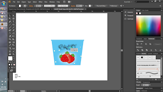

With an outer glow effect, some round shape drawn portraying snow and a multiple numbers of fruits each cup represent its respective sizes. (Small = strawberry; Medium = Apple; Large = Watermelon) *notes size of fruits = size of cup)


Three Different cups, different sizes : Only at CAGSY

The concept is nice, as I'm going to use the same concept to differentiate the cup size.
Planning to design fruits to differentiate the cup size. Example would be either strawberry or grapes for small cup size, for medium size either apple or orange and Watermelon as the large cup size.
The background color of CAGSY's cup would come in various color according to the fruit. The brand should also be included on the cup to avoid copyright, as it is originated from the brand itself, CAGSY. The tagline to explain CAGSY would also be included inside.
The packaging should not be as sophisticated as it is. It shall be a simple image, brand name and color background as customers just use the cup as a platform to fill frozen yogurt in it nothing more. Then, it would be dispose off.
Reference
https://blogger.googleusercontent.com/img/b/R29vZ2xl/AVvXsEi-FsBtQhxU51LuDh0auqwAWe6swaOD5m_Zb0v5nIpLnaAwOspNII9ywJk_o1nwSziJHCb5McIib5wTqJlsi3gnYk_HK4UdvZWenv0FMZjqIHkv8AZxAYQM1Go0_S2ipy29LvnHidIV_0qB/s1600/DSC01844.JPG
Concept and Idea
My first two sketches and still in doubt of which fruits to design.

Still thinking of which part of the watermelon should I design, a slice or the entire watermelon

Planning to design also the spoon and different size for different cup. To add on, I'm also planning to design the cup cover for those customers that decide to have their frozen yogurt take away. Different size would be different design.
After a few days, I decided to decorate a reusable spoon, where customers can use the spoon, wash it and use it again, and it comes in 2 designs.

CRAFTING

Basically, I started off by designing the watermelon spoon. I thought of adding sophisticated colors into it but, yet again I want to keep it simple. Right here, I use the pen tool for tracing, and also shape tool.

Added the color green onto the handle of the spoon and also drew some spots by using the shape tool (eclipse). Spammed on (ctrl+c and ctrl + v). Besides that, those seeds were adjusted manually to look different in sizes and resemblance a slice of watermelon.

In the next picture, I used the pen tool and draw lines. Then by using the Wrinkle and Bloat tool the straight lines were then cursive, sharp pointy edges which looks like a radio frequency. Now, it looks more like the pattern of a watermelon. Thus, I added a purplish- pink for the juicy part of the watermelon.

By adding the 3d effect under 'effects'. This is how the final piece of the spoon looked like.

Next, I was trying to design the Apple spoon, traced a picture of an apple, along by using the shape tool to design the handle of the spoon.

Combining both images that I design, I grouped them together and played with the Mesh tool. Adding red to the spoon and playing around with the Mesh tool makes the spoon 'alive'. With that, I avoided using the 3d effects for this spoon, cause it looks real as now it is.

This is just a simple picture, of me designing a simple cover, for those customers that would take away their frozen yogurt, nothing special. The use of pen tool was all I need and just used the 'warp tool' the shape the edges nicely.

Traced a strawberry image (http://www.how-to-draw-cartoons-online.com/image-files/cartoon-strawberry.gif). And then multiply it by 3, by holding alt+ and dragging it. Colored them and adding stroke to all the design in canvas.

By using the same watermelon and enlarging it (shift + drag), planning to use it as a design for the cup. This also applies to the strawberries I drew and the Apple which I reused from the spoon but added the mesh tool and brighter as such Inner glow. Next slide would be showing the design of the cup in 3 sizes (Small, Medium, Large).


With an outer glow effect, some round shape drawn portraying snow and a multiple numbers of fruits each cup represent its respective sizes. (Small = strawberry; Medium = Apple; Large = Watermelon) *notes size of fruits = size of cup)


Three Different cups, different sizes : Only at CAGSY
Monday, October 15, 2012


Saturday, September 29, 2012
CAGSY Logo Design
Research
Based on that website, I can see that it is colorful and has many sorts of fruits. As mentioned, Tutti Fruiti is targeting people of all ages, generation Y, Generation X, baby boomers and also the new generation Z (Hamid, 2009). In my opinion, due to the attractiveness of the logo and the concept Tutti Fruiti is showing, the target audience is mostly young adults and teenagers. To add on, most youngsters these days, prefer to consume Chatime, which is a bubble tea franchise originated from Taiwan. Asyraf (2011) speculates that Tutti Fruiti is overprice as he added on 100 grams of Tutti Fruiti costs MYR 5.30. Could this be a reason why teenagers these days chose Bubble tea over frozen yogurt as it is much cheaper?
That brings me to my post for today, possibly targeting Generation Y and also Generation Z (iGeneration). The Gen Y considers these 4 areas before purchasing a product or service: cheap cost, quality, fast service and an 'experience' (Fields, n.d). As for myself living in the same generation, I believe we are in a spoiled generation and we are being very selective over things. That brings me to the question how should one logo or brand attract this generation: simplicity, brevity, or sophistication? Furthermore, for the later assignments which includes the merchandise how do I design that 'fits' these generations?
I came up to several ideas that the logo should be colorful. Not many colors should be involved only certain ones to make the logo unique, simple and memorable, such as Nike, Adidas and McDonald.

Logo such as this is simple yet eye catching. Previously, my lecturer taught me about balancing and alignment, this logo has a good example of it. The blue spoon shows authority, dignity and faithfulness (Reed, 2007). In my opinion, the blue represents a guy, where as the pink represents the girl. Pink is a color which shows femininity innocence, softness and healthy (Reed, 2007).
This would just be a rough idea on how I'm getting started on my logo although there is not much time left. Still there are few other research that has to be done which includes the words below the picture and what color to use for the logo as well as what image to sketch.
Reference
http://behance.vo.llnwd.net/profiles25/721052/projects/3799199/868991cd207f1254c97b56f8c01a0fab.jpg

Reed, N. (2007, March 5). Color Psychology of Logos. In Top 10 Logo Designers . Retrieved September 30, 2012, from http://www.logoblog.org/wordpress/color-psychology-of-logos/
Fields, B. (n.d.). Small Business Marketing. In Marketing to Gen Y: What you can''t afford not to know. Retrieved September 30, 2012, from http://www.startupnation.com/business-articles/9011/1/marketing-GenY.htm
Rahim, A. (2011, July 3). Tutti Frutti Yogurt Ice Cream; Why is it so damn expensive?. In Caim . Retrieved September 30, 2012, from http://asyrafhjrahim.wordpress.com/author/asyrafhjrahim/
Hamid, H. (2009, October 22). Naza Tutti Frutti expects fruitful growth in first year Read more: Naza Tutti Frutti expects fruitful growth in first year . In Business Times. Retrieved September 30, 2012, from http://www.btimes.com.my/Current_News/BTIMES/articles/21FRUTTI/Article
Brainstorming/Concept and Idea
As I did some brainstorming with myself and some college friends, I came across 3 names that I should put for my brand/logo
You-HO (Its about how Yogurt greets you)
YOGO (Inspired by YOLO* = You only Live once)
YFL = Yogurt for Life
I came to the conclusion noticing Generation Y likes catchy words, conform and be trendy cause they do like to feel left out. Therefore, I planning to come up either one of these name as my logo as for the sketch I already have an idea and will begin work tomorrow
You-HO (Its about how Yogurt greets you)
YOGO (Inspired by YOLO* = You only Live once)
YFL = Yogurt for Life
I came to the conclusion noticing Generation Y likes catchy words, conform and be trendy cause they do like to feel left out. Therefore, I planning to come up either one of these name as my logo as for the sketch I already have an idea and will begin work tomorrow


Messy I know, that is how I sketch till I come up with the final art piece.

Even though that's my final sketch piece, I done a lot of changes in Adobe Illustrator to enhance its texture.
CRAFTING

After scanning the sketch, I adjust the stroke to 2pt. To add on, changing the lines from uniform to Width profile 2, I tested the rest but seems it looks better on this option.

After playing around with the stroke and variable width profile. I head over to the line segment tool and drew a line. By holding shift and drag I manage to get a fine straight line. Then after, I play each letter 'C,A,G,S and Y' on the line ensuring it is straight and applying the Typography theory which includes baseline and adjusting the X-height.

Once all the letters were placed strategically and in an order, I began grouping all of the letters to avoid missing pieces when I drag and also to make future editing a lot easier (effects).

Without wasting time, I took out the fruits from the basket one by one and began to color them. For the grapes, I was just putting a purple color. Gradient didn't come to my mind as each grape is minute and does not need any gradient fill as I want to keep it simple as for the rest of the fruits I touch on something else.

For the banana, I used the Mesh tool and played around with it. I chose a slightly light yellow and played around with it. As for the end of the banana I used a black solid color to fill in.

Same goes for the remaining fruits I used mesh tool and play around with it. Then I deleted the CAGSY word on the yogurt cup and copy/paste the huge CAGSY word and play around with it. I readjust the size by holding shift + drag to get a proper size and drag it back to the yogurt cup space.


Once I placed the words back, I added peppermint color towards the cup. I thought of staying for white but it was to dull and simple, besides the fruits covered the color red,pink,green,purple and yellow. Then, I readjusted the CAGSY next to the yogurt cup along by using Typography I added a phrase.
Besides that, I put the effect Drop Shadow towards all element on the canvas. 85% opacity. To add on, I change the font of the phrase to 'Comic Sans MS' and set a distance towards each word. Also, I aligned those words in the middle.

Then, I clicked on the warp tool and readjust the CAGSY due to some crooked line I traced when I used the pen tool easier, making it smoother and fine. Then, I grouped all of the elements on the canvas together. By putting grids and readjusting the logo, and putting 'balance' into practice the final product is as follow.

Colorful, classy and simple. Colors can attract people and instill in people's mind easier. The word 'CAGSY' is cursive to show classy and class. It shows that the brand is not merely a cheap brand. Its more of an exclusive brand but not that expensive as the casualness of the font from ' Come and get some yogurt'. To add on, the fruits shown in the yogurt cup are the flavors served in the CAGSY.
Sunday, September 23, 2012
Design principal exercise

Subscribe to:
Posts (Atom)